sale! 25% off orders $25+ use code: early25
The Secret Language of Chocolate Wrappers
How Packaging Tells a Story
Imagine unwrapping a chocolate bar and pausing to admire the wrapper before you even taste a bite. That moment of anticipation — the crinkle of foil, the flash of color, the hint of a story in the design — is no accident. Chocolate packaging speaks its own secret language. From ornate Victorian chocolate boxes to today’s sleek artisan bar wrappers, the way chocolate is packaged has evolved over time to tell stories, reflect cultures, and stir emotions. Let’s take a delightful journey through time and around the world to decode what our chocolate wrappers are saying.
From Victorian Elegance to Modern Minimalism: A Brief History of Chocolate Packaging
In the 19th century, when chocolate first became widely available, its packaging was all about luxury and romance. Early chocolate boxes in the Victorian era were often as treasured as the sweets inside. Confectioners packaged chocolates in elaborate gift boxes decorated with satin ribbons, lace, gilded embossing, and Victorian artwork. Cherubs, roses, and idyllic scenes adorned these boxes, signaling that giving chocolate was a heartfelt gesture. In 1868, for example, Richard Cadbury introduced the first heart-shaped chocolate box for Valentine’s Day – a decadent red box filled with cupid and flower motifs that told a story of love at first sight. For the wealthy Victorian recipient, the ornate packaging itself — sometimes made of wood or velvet-covered paperboard — was a keepsake meant to be saved long after the chocolates were gone.
As chocolate treats grew more accessible in the early 20th century, packaging shifted toward branding and practicality. Chocolate bars emerged, wrapped simply in paper or foil-lined paper to keep them fresh. At first these wrappers were plain, but soon bold logos and brand names were printed to catch the eye. Iconic brands like Hershey’s and Cadbury began using distinctive colors and typography on their wrappers even before 1910. (Cadbury’s Dairy Milk, for instance, adopted a royal purple wrapper in 1915 to signify quality and regal indulgence.) On the other side of the Atlantic, the Hershey’s Milk Chocolate bar came in a no-nonsense brown wrapper with large white block letters — a design so timeless that it still evokes a bit of American nostalgia today. By mid-century, the golden age of candy packaging had arrived: the 1950s and 60s saw chocolate bars and bonbons wrapped in shiny foils, sealed in cellophane, or tucked into colorful tins. Premium chocolatiers like Godiva introduced their signature gilded boxes tied with ribbon, instantly communicating elegance. Mass-market candy bars, meanwhile, sported cheerful and sometimes cartoonish wrappers (think of the playful characters on a Mars or M&M’s package) to signal fun and sweetness. Whether luxurious or whimsical, packaging in this era set a mood before the first bite.
Fast forward to the late 20th century and beyond, and chocolate packaging continued to innovate in tandem with consumer tastes and values. The 1980s and 90s brought more modern graphic designs – some wrappers went bold and bright to grab attention on store shelves, while others embraced clean, minimal layouts to appear sophisticated. Packaging materials also evolved: lightweight plastic wraps and foil pouches became common for efficiency, but at the same time many high-end brands kept using foil and paper combinations to preserve that crinkle of tradition when unwrapping. In recent years, a new wave of artisan chocolate makers has treated wrappers as a canvas for art and storytelling. Today you might pick up a craft chocolate bar wrapped in recycled art paper printed with illustrations of cocoa farms or abstract designs that reflect the flavor notes of the chocolate. Sustainability is in style too – minimalist, eco-friendly packaging with earthy tones or simple cardboard boxes have become popular, echoing consumers’ environmental values. Yet even at its most modern and minimal, chocolate packaging still aims to spark an emotional connection. It might be a spark of childhood nostalgia from a retro-looking label, or the thrill of exclusivity from a sleek black gourmet bar wrapper. Over the centuries, the outside of a chocolate has become as meaningful as the inside, evolving in design but always whispering promises of what delight awaits.
Swiss Artisanal Elegance in Every Detail
When it comes to chocolate, the Swiss are known not just for their impeccable quality but also for the elegance of their presentation. Swiss chocolate packaging often exudes an old-world charm that reflects the country’s heritage of craftsmanship. Many Swiss brands favor designs that are understated yet luxurious – the kind of wrapper that feels like it might have been hand-wrapped by a chocolatier in a quaint Alpine shop. Think of the classic gold foil and delicate paper band on a bar of Lindt chocolate, or the way a box of Luxemburgerli chocolates from Zurich’s Confiserie Sprüngli is tied with a satin ribbon. These touches speak the language of artisanal quality loud and clear.
Swiss wrappers also love to hint at local pride and tradition. The iconic Toblerone bar, for instance, comes in a triangular prism box that itself is a story: its unique shape and the Matterhorn mountain logo celebrate the Swiss Alps and the bar’s Bernese origins. Even stripped of its lettering, that Toblerone triangle is recognizable worldwide – a symbol of Swiss ingenuity in packaging design. Other Swiss packages might incorporate imagery of alpine vistas, edelweiss flowers, or heraldic fonts that look like they belong on a Swiss coat of arms. The color palettes often lean toward the regal and refined: deep reds, rich browns, and of course touches of gold that imply the gold standard of chocolate. When you hold a piece of Swiss chocolate in its wrapper, the feel is often thick, high-quality paper or foil – sturdy and polished, much like a Swiss watch case. Unwrapping it feels ceremonial. In fact, part of the pleasure of Swiss chocolate is slowing down to unwrap the story of tradition and excellence that the packaging conveys. It’s as if each wrapper is quietly saying, “This is Swiss-made, with love and pride.” By the time the chocolate meets your tongue, you’ve already tasted a bit of Switzerland’s elegant soul through its packaging.
Japanese Minimalism and Mindfulness in Packaging
The understated beauty of minimalist Japanese chocolate wrappers speaks volumes with subtlety. In Japan, the art of packaging is nearly as important as the treat itself. Many Japanese chocolate brands embrace minimalism and precision in their wrapper designs, reflecting cultural values of simplicity, harmony, and respect for detail. A Japanese chocolate bar might come wrapped in crisp white paper with just a tiny logo and a thin band of color – so pared down that it radiates confidence. This kind of design, with monochromatic or very restrained color schemes and plenty of white space, creates a sense of calm elegance. It’s rooted in the idea that less is more, a concept akin to the Japanese aesthetic of wabi-sabi (finding beauty in simplicity). One modern example is the Tokyo-based brand Minimal, which wraps its bean-to-bar chocolates in sleek white packages with clean type and subtle geometric patterns. The effect is like a Zen garden in wrapper form: orderly, refined, and thoughtful.
Japanese packaging often carries an air of mindfulness. It’s not just about looking good – it’s about enhancing the experience of enjoying the chocolate. For instance, if you buy a box of artisan chocolates in Japan, you may find each piece individually wrapped inside, perhaps separated by delicate paper dividers. This practice stems from omotenashi, the spirit of Japanese hospitality – the idea that every detail, down to packaging, should graciously honor the recipient. Unwrapping each chocolate becomes a small, joyful ceremony. Even when designs are more playful (Japan is also famous for colorful, cute packaging on candies and seasonal KitKats), there is intention behind every element. Many Japanese wrappers feature touches of cultural storytelling: a label might include a tiny illustration of cherry blossoms for a spring edition chocolate, or a pattern inspired by traditional kimono textiles. These details connect the product to Japan’s rich art and seasonal traditions. And sometimes, packaging goes beyond paper and foil – it transforms into cloth. A popular gift presentation is to wrap a box of chocolates in a beautifully printed furoshiki cloth, which can be reused and cherished. This adds a special cultural flair, turning the chocolate into a gracefully wrapped gift that says omiyage (a heartfelt token of affection or thanks). In Japanese chocolate culture, the wrapper’s language is gentle but profound: it whispers of purity, seasonality, and care, inviting you to savor not just the flavor but the moment.
American Nostalgia and Whimsy Unwrapped
America’s chocolate wrappers often speak in a warm, familiar drawl — one that evokes childhood memories, pop culture, and a dash of fun. Nostalgia is a key dialect of the American chocolate wrapper language. Consider the humble Hershey’s bar again: its wrapper design has remained so consistent through the decades that tearing open that brown-and-silver paper can transport an American adult back to summers at camp or nights at the movies making s’mores. Many U.S. chocolate brands deliberately keep a retro look to tap into these emotions. The crinkly foil around a Reese’s Peanut Butter Cup, the old-fashioned script logo on a Russell Stover chocolate box, or the polka-dotted fun of a Wonka Bar (even the fictional wrapper from Charlie and the Chocolate Factory holds iconic status!) all play on a collective memory. These designs tell a story of simpler times and beloved traditions. A wrapper might even be a direct replica of its mid-century version, because brands know that the sight of a vintage design can make loyal customers smile and new customers curious about the history.
At the same time, American wrappers have always been about bold marketing and playfulness. Bright colors, big logos, and sometimes even cartoon characters are hallmarks of the candy aisle in the USA. Take M&M’s, whose packages feature those famous little candy characters grinning and hamming it up — the wrapper itself feels like part of the entertainment, promising that what’s inside will be just as fun. Or think of Cracker Jack’s old carnival-esque box design with red and white stripes and a prize inside, implying that opening it is an adventure. That sense of whimsy carries through to many chocolate-coated snacks and bars; whether it’s a caramel-filled bar showing off a gooey bite on the label or a Halloween candy in spooky themed wrapping, American packaging often shouts its message: this is yummy, this is fun, you know you want it! Even upscale American chocolate makers sometimes infuse a bit of humor or storytelling in their packaging — for instance, a craft chocolate bar might include a tiny story about its cocoa farm on the wrapper, or quirky artwork that gives the brand a friendly personality. The psychology here is that a cheerful, familiar package builds trust and happiness. It’s like a friend inviting you to enjoy a treat. From the elegant foil on a Ghirardelli square that says “San Francisco heritage” to the neon-colored wrapper of a sour candy chocolate bar that screams “new and exciting,” American chocolate packaging speaks to the kid in all of us. It reminds us that opening a chocolate is not just about indulging our taste buds, but also about indulging our sense of play and nostalgia.
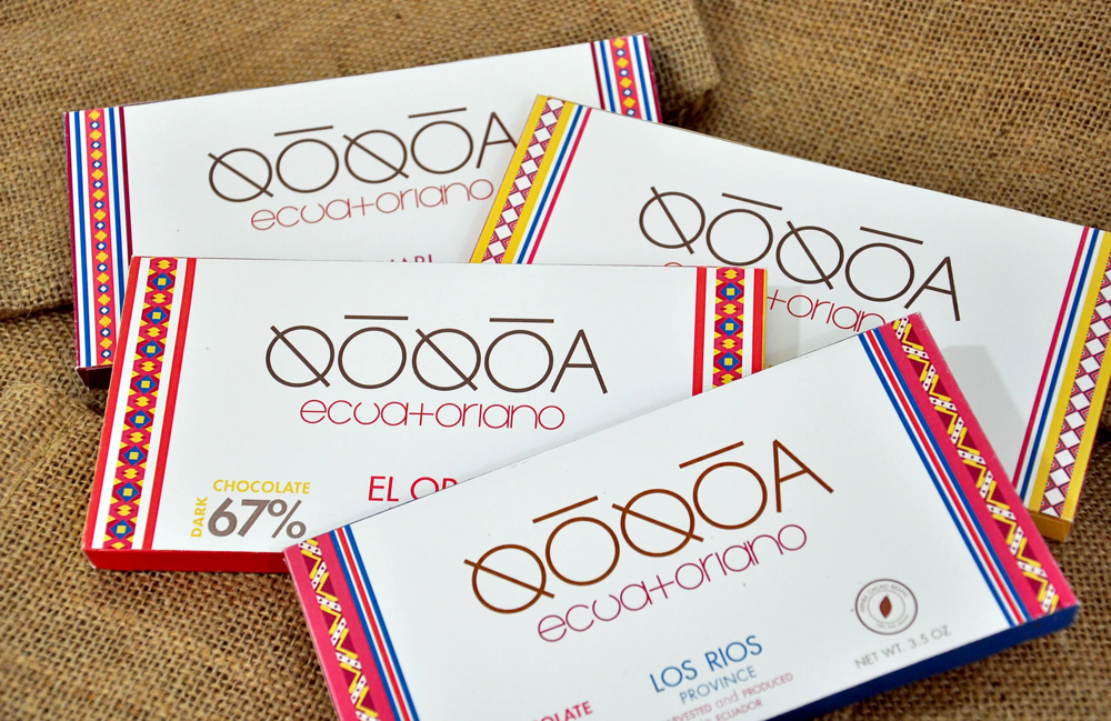
Latin American Boldness and Heritage in Design
Vibrant patterns and bold colors adorn many Latin American chocolate packages, reflecting a rich cultural tapestry and a proud cacao heritage. In the regions where cacao has been cultivated for centuries — from the lush plantations of Ecuador and Colombia to the colorful markets of Mexico — chocolate wrappers often celebrate this sense of origin loud and clear. One of the first things you might notice on a Latin American chocolate bar wrapper is the explosion of color. It’s common to see deep tropical hues like bright turquoise, sunflower yellow, cacao pod orange, and chili pepper red all sharing space in a single design. These colors aren’t random; they echo the vivid landscapes and art of Latin America, from the textiles of the Andes to the murals of Mexico. The packaging seems to dance with life, much like a fiesta in full swing.
Design motifs on these wrappers frequently draw from indigenous art and historical symbols. For example, an Ecuadorian chocolate brand might frame its label with Incan-inspired geometric borders or bold stripes that resemble traditional weavings.
A Mexican chocolate bar could feature Aztec or Mayan patterns, stylized cacao pods, or a tiny graphic of Quetzalcoatl (the mythical serpent god associated with cocoa in Mesoamerican legend). These visual elements tell stories of the ancient roots of chocolate as “the food of the gods.” Just by its wrapper, a bar can transport you to a cacao farm or a colonial hacienda where chocolate has a legacy. Latin American packaging also often blends old and new in exciting ways. You might see a sleek modern logo set against a backdrop of folk-art illustrations, or a minimalist box wrapped with a vibrant woven ribbon. The message is both heritage and vivacity: this chocolate carries tradition, but it’s also full of passion and joy.
Another hallmark is the use of bold typography and language. The names of the chocolates or the cacao origins might be printed in flourishy, artistic fonts, or sometimes in hand-drawn letters that feel very human. It’s not unusual for a Peruvian or Brazilian chocolate wrapper to proudly announce the cacao’s origin region in decorative text, almost like a passport stamp of authenticity. Materials play a role too — some premium Latin American chocolates are enclosed in rustic, earthy paper that nods to natural fibers, or even slipped into little burlap bags to evoke sacks of cocoa beans. All of these choices create a narrative: when you unwrap a Latin American chocolate, you’re unwrapping a piece of cultural heritage. The wrapper’s bold voice says “we are alive with flavor and history,” preparing you to experience chocolate that’s as spirited as the people and places it comes from.
The Ingredients of a Wrapper’s Design: Materials, Colors, and Shapes That Speak
Not all chocolate wrappers speak the same way, but they all use similar “ingredients” in design to convey messages. Everything about a wrapper — the feel of the material, the colors and images, the lettering, and even the shape of the package — works together to tell a story. Here’s a look at how these elements communicate:
Material Matters (Foil, Paper, and More): The very feel of a chocolate wrapper sends signals about the treat inside. A foil wrapper gleaming under the light hints at something precious; it keeps chocolate fresh and gives a little crinkle of excitement when unwrapped. Foil has long been used to imply quality and celebration (those shiny gold-foil chocolate coins or holiday candies, for example, feel like treasure). Paper wrappers can vary from smooth and glossy to thick and velvety. A glossy, colorfully printed paper might say “fun and modern,” whereas a textured, uncoated paper with natural fibers whispers “artisan and eco-friendly.” Many classic chocolate bars actually use a combination: foil inside for freshness, paper outside for branding — so you get the best of both worlds. And then there are special touches: a fabric or ribbon accent (like a satin bow on a box, or a cloth wrap) immediately signals that this chocolate is a gift, meant to be savored. In some cultures, wrapping a chocolate box in cloth (such as Japan’s furoshiki) or enclosing treats in little organza bags adds a personal, hand-crafted feel. Even modern sustainable materials speak volumes: a biodegradable wrap tells you the company cares about the earth, adding a feel-good layer to your indulgence.
Color Palette and Imagery: The colors on a chocolate wrapper are like the tone of voice in a story — they set the mood. Rich dark colors (think black, deep purple, royal blue) often indicate luxury or high cocoa content, preparing you for an intense, grown-up flavor inside. In contrast, bright playful colors (yellows, pinks, oranges) shout sweetness, joy, and maybe a hint of whimsy, suggesting the chocolate is light-hearted or aimed at kids (or the kid in you). Red and gold are colors you’ll see on many special edition chocolates because they scream celebration — not just in Western contexts like Valentine’s or Christmas (red for love, gold for luxury), but also in places like China where red and gold symbolize luck and happiness (imagine red foil-wrapped coins for Lunar New Year). Pastel colors on an Easter egg chocolate wrapper softly say “springtime and innocence,” while a silver or icy blue wrapper on a peppermint chocolate might evoke cool winter vibes. Imagery plays its part too: a picture of a silky chocolate swirl on the wrapper tempts your taste buds visually, whereas hearts, flowers, or butterflies set a romantic or whimsical scene. Some wrappers feature illustrations that practically tell a short story — a vintage scene of a family sharing chocolates around a fireplace (evoking comfort), or a stylized cacao tree drawing (signaling authenticity and natural origins). Every color and image is chosen on purpose to signal emotions: whether it’s love, fun, tradition, or adventure.
Typography and Fonts: The lettering on a wrapper isn’t just to tell you the brand name — its style adds to the story. Elegant cursive or script fonts often imply heritage and sophistication. When you see flowing, ornate letters spelling out a chocolate’s name, you might subconsciously think of old-timey boutiques and European cafés. This is why brands like Lindt or Cadbury use cursive logos that suggest a long tradition and personal signature of quality. On the flip side, big bold block letters in all-caps (like the classic HERSHEY’S or SNICKERS logos) convey strength, simplicity, and confidence — they’re straightforward, just like a dependable treat you loved growing up. Playful or funky fonts, maybe with a swirl or a bounce to the letters, indicate that the chocolate has a sense of humor or creativity (imagine a curly font on a whimsical chocolate flavor, inviting you to have fun). Some wrappers use hand-drawn or artisanal-style lettering, which makes it feel personal, as if the chocolatier labeled it by hand. This is common on small-batch chocolates to give a human touch. In international markets, the script itself can be visually intriguing: for instance, Arabic calligraphy on a Middle Eastern chocolate box looks artful and luxurious to any eye, or Japanese kanji characters on a wrapper might signal authenticity and exotic flavor. Ultimately, the font and layout choices are carefully tuned to the brand’s personality: whether it’s modern and minimalist (clean thin sans-serif type for a chic look) or loud and retro (thick, shadowed letters for a throwback feel), typography helps voice the wrapper’s message without you even realizing it.
Shapes and Form Factors: Not all chocolate comes in a simple bar shape, and packaging has gotten wonderfully creative to accommodate special forms. The shape of the packaging itself can be a storyteller. The classic heart-shaped chocolate box is the perfect example — one glance at that red heart box and you know it’s saying “I love you” louder than any words could. Similarly, holiday chocolates often play with shapes: think of egg-shaped packages for Easter chocolates, Christmas chocolates in tree- or star-shaped boxes, or advent calendars that hide chocolates behind little numbered doors — each format builds excitement and ritual. Brands also use signature shapes to become unforgettable. We talked about Toblerone’s triangle; another famous one is Ferrero Rocher’s spherical gold foil wrapping, which, when arranged in a pyramid, makes the chocolates look like little golden ornaments. Even the silhouette of a wrapper matters: a long, slender package might hint at refinement (like the slim box of luxurious truffles), whereas a chunky, oversized wrapper implies a big, hearty treat (like king-size candy bars that practically shout abundance). Some modern gourmet bars come in unconventional packaging like tubes, tins, or sliding drawer boxes — these novel forms communicate that the chocolate is unique, upscale, or experimental. And don’t forget the unboxing experience: multi-layered packaging (an outer box, inner foil, maybe a paper sleeve) slows down the ritual of opening the chocolate, building anticipation and making it feel like opening a gift. In contrast, a simple tear-open pouch says “casual snacking, dive right in!” Shape and structure, from the outer box to the way a wrapper folds or tears, all contribute to how the chocolate story is delivered to you.
The Psychology of Packaging: How Wrappers Influence Our Cravings
Beyond aesthetics and cultural cues, chocolate wrappers have a direct line to our feelings and choices through psychology. The saying “we eat with our eyes first” is absolutely true when it comes to sweets. A well-designed wrapper can make your mouth water before you even smell the chocolate inside. Consumer perception is strongly shaped by packaging — our brains tend to judge the quality of a product by its cover, especially with treats. If you see a bar in a matte black box with gold foil lettering, you’ll likely expect a luxurious, intense chocolate experience (and you might be willing to pay more for it), whereas a candy bar in a brightly colored plastic wrapper with a goofy mascot might promise a lighthearted, sweet-and-simple snack. We subconsciously associate heaviness or sturdiness of packaging with value, which is why premium chocolates often come in hefty boxes or thick wrappers that feel substantial in your hand. It tells your brain, “This is special, take your time.”
Color psychology also plays a role in how we taste and enjoy chocolate. Some studies have found that people perceive chocolate as sweeter or more flavorful when it’s presented in certain colored wrappers. For instance, a dark chocolate in a sophisticated dark brown wrapper might be judged as richer, or a milk chocolate in a creamy pastel wrapper might seem smoother, all because of the expectations the packaging sets. Wrappers can even influence our buying impulses and cravings. A flash of red (a color known to stimulate appetite) or a picture of melting chocolate can trigger you to reach for a treat, thanks to how our brain releases dopamine at the promise of reward. Marketers know this and design wrappers to literally whet the appetite.
There’s also an emotional conditioning at play: over time, we build personal associations with certain packages. The sight of a familiar wrapper can evoke comforting memories — maybe your grandmother always had a box of those gold-foil wrapped chocolates on her table, so seeing that packaging now feels like a warm hug. Or perhaps you remember getting a specific candy bar as a reward after school, so its wrapper design still sparks a little feeling of pride or happiness. Brands often capitalize on this by keeping their look consistent or bringing back “retro” wrappers to tap into nostalgia (because who doesn’t love reliving happy memories?).
The storytelling aspect of packaging deeply enhances our enjoyment too. When a wrapper includes a narrative (like a note about fair-trade farmers or a snippet about the chocolatier’s passion), it invites us to connect on a human level. We start to appreciate the chocolate not just for its taste, but for the journey and care behind it. This can make the chocolate feel more delicious and satisfying, knowing the positive story attached. Even without explicit text, a wrapper’s visuals and vibe tell a story that can align with our identity or aspirations. Buying a hip new artisanal bar with edgy artwork might subtly make us feel part of an adventurous foodie community. Gifting a heart-adorned box communicates love and care to the receiver before they ever take a bite. In these ways, the wrapper influences not only how we perceive the chocolate’s flavor and quality, but even the decision to pick it up in the first place and the joy we get from sharing or devouring it.
Unwrapping the Story in Every Chocolate
The next time you indulge in a chocolate, take a moment to notice the wrapper’s secret language. In your hands you might hold more than a sweet treat – perhaps it’s a little piece of history wrapped in Victorian-inspired swirls, or a slice of culture decked out in vibrant patterns. Maybe it’s whispering promises of romance with a heart and ribbon, or playfully nudging your inner child with a familiar cartoon. Chocolate packaging has the remarkable ability to tell stories and spark emotions without a single word. It’s a storyteller that works through color, shape, texture, and imagery, turning a simple candy into an experience.
Over the years, what started as plain protective wrapping has become a rich communicative art form. Each wrapper carries the imprint of its time and origin: the values of an era, the aesthetics of a place, the marketing trends and innovations, and the feelings merchants and makers wish to share with you, the chocolate lover. When you peel back the foil or undo the bow, you’re not just accessing the confection inside – you’re participating in a ritual that humans have refined for generations, one that combines flavor with fantasy. So go ahead, crack open that chocolate bar or lift the lid of that truffle box, and enjoy the story it’s telling. In the secret language of chocolate wrappers, delight is dialect universal – and every wrapper is an invitation to savor both a taste and a tale. Bon appétit!
Contact
info@menloparkchocolatecompany.com
© 2025 Menlo Park Chocolate Company. All rights reserved.
Subscribe to receive special offers and to hear about new product drops!